One very important convention used in all film opening is the font style used to introduce the producers, directors, music directors and also some of the actors staring within the film. Over time the text used within the openings of the horror genre has evolved and made the openings of horror films today much more effective, not by exaggerating the font style but by simplifying it however still in relation to the film. By doing this it promotes a sense of realism about the film, the over exaggerated font styles almost makes the film seem a joke or a comedy - so much so the scary movie films (a sequence of films made which mimic/take the mickey out of previous horror films made) have used an exaggerated font style.


1927 - The 13th Hour
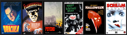
1931 - Dracula
1931- Frankenstein
1944 - dead mans eyes
1958 - Monster on the campus
1960 - Psycho
1968 - Night of the Living Dead
1978 - halloween
1996 - Scream
2005- An american Haunting
2010 - A nightmare on Elm St
2011 - 11- 11 - 11
2011 - The Task
As you can see the titles and fonts of films has changed drastically over time, the common conventions of red, blacks and dark dull colours are now used within horror films in opposition to the blues, yellows, greens etc which were used many years ago. The names of films has also become much more simpler and effective.


No comments:
Post a Comment